Loops with x-for #
Let’s directly jump into creating dynamic lists using the x-for directive in Alpine.js. This is one of the most useful directives for rendering lists based on an array of data. When you fetch some data from an API, you can easily loop through it and display it on your webpage. In our case we are not going to fetch any data, but I want to demo how this works by making a loop for the belt colors options in the <select> element. So rather than coding each of these options by hand we are gonna make a loop to output all of them instead.
Let’s atart by storing the belt choices inside the data object, which we can then loop through to output each one in its own <option> tag.
beltChoices: ['black', 'brown', 'purple', 'blue', 'green', 'yellow', 'white'],Now we can use the x-for directive to loop through each of these belt choices and output them as options in the select dropdown.
<select x-model="beltColor">
  <option value="">Select a belt color</option>
    <template x-for="color in beltChoices" :key="color">
      <option :value="color" x-text="color.charAt(0).toUpperCase() + color.slice(1)"></option>
    </template>
</select>
Here, we are using x-for="color in beltChoices" to loop through each color in the beltChoices array. The :key="color" is used to give each option a unique key, which helps Alpine.js keep track of the elements efficiently. The :value="color" binds the value of each option to the corresponding color, and x-text is used to display the color name with the first letter capitalized. Make sure to include only one root element inside the x-for loop, which is why we are using a <template> tag here.
Controlling Visibility with x-show #
Let’s use another Alpine.js directive called x-show to conditionally hide or show a modal in the page. The idea of conditionally showing content might sound familiar and it should do because we have already used x-if in the previous tutorial. However, there is a key difference between x-if and x-show. When you use x-if, the element is completely removed from the DOM when the condition is false. On the other hand, x-show simply toggles the visibility of the element using CSS, meaning the element remains in the DOM but is hidden from view. Which directive you choose to use depends on your specific use case. Now we know the difference between x-if and x-show, let’s implement a modal which shows once the form is submitted and if there is no errors.
Before we implement the modal, we need to add a new data property called success to our Alpine.js component to track whether the form submission was successful.
success: false,We make this property true when the form is submitted successfully.
handleSubmit($event) {

      this.validateForm();
      console.log(this.errors);

      if (Object.keys(this.errors).length === 0) {

        console.log(this.username, this.password, this.beltColor, this.bio, this.newsletter);

        $event.target.reset();

        this.success = true;

      }

    },
At the very bottom of our HTML, we can add the modal structure. This modal needs to be inside the <form> element because we are using x-data on the <form>. Below the submit button, add the following code:
<div class="overlay" x-show="success">
  <div class="modal">
    <h2>Thank you!</h2>
    <button type="button" @click="success = false">Close</button>
  </div>
</div>
If you are using the CSS file I have given in the first tutorial, you should already have the styles for the modal and overlay. If you don’t have it, you will see some generic template below the form when you submit it successfully. The x-show="success" directive will toggle the visibility of the modal based on the value of the success property. When the form is submitted successfully, the modal will appear, and clicking the “Close” button will set success back to false, hiding the modal.
In the above video, you can see display: none; being applied to the modal when it is hidden and removed when it is shown. This is how x-show works under the hood. If we reload the page you’ll see a slight flicker of the modal before Alpine.js initializes and applies the x-show directive. To prevent this flicker, we can use the x-cloak directive.
<div class="overlay" x-show="success" x-cloak>We also need to add some CSS to hide elements with the x-cloak attribute until Alpine.js is fully loaded. Add the following CSS to your stylesheet:
[x-cloak] {
  display: none !important;
}
Transitions #
Now that we have our modal working with x-show, but it just appears from nowhere. It would be nice to animate or transition the modal in instead. The effect I would like to go for is where the overlay fades in first and then the modal itself drops in from the top of the screen. We can do this pretty easily using Alpine.js.
There are two transition that we want to make, first is for the overlay and second is for the modal. We are goind to start with the overlay which we just want to fade in over maybe half a second. To do this we can use the x-transition directive on the overlay div like so:
<div class="overlay" x-show="success" x-cloak x-transition.opacity.duration.500ms>The x-transition.opacity.duration.500ms directive tells Alpine.js to apply a fade-in transition over 500 milliseconds when the overlay is shown or hidden. The opacity part specifies that we want to transition the opacity property.
Next, we can add a transition to the modal itself. I want to transition in the modal separately, so it drops down from the top of the page somewhere after the overlay has faded in. Currently, the modal is a child of the overlay div, so the opacity transition we just added to the overlay will also affect the modal. If you want to add a different transition to any of the child elements, you need to two things, first you need to add the x-show to the elements you want to have a different transition and it’s going to have the same condition as the parent element. We have to do this so that this element gets shown and hidden independently from its parent so we can transition it independently as well. Then we need to add the x-transition directive to the child element with the transition we want. So let’s add x-show="success" and x-transition to the modal div like so:
<div class="modal" x-show="success" x-transition:enter-start="off-screen" x-transition:enter-end="on-screen">Here we are using custom classes off-screen and on-screen to define the starting and ending states of the modal during the transition. We need to add these classes to our CSS file to define how the modal should appear when it is off-screen and on-screen.
.modal {
  transition: all ease-in 300ms;
  transition-delay: 300ms;
}

.modal.on-screen {
  transform: translateY(0);
}

.modal.off-screen {
  transform: translateY(-100vh);
}
In this CSS, we define a transition for the modal that lasts 300 milliseconds with an ease-in timing function. The transition-delay of 300 milliseconds ensures that the modal transition starts after the overlay has finished fading in. The on-screen class sets the modal’s position to its normal place, while the off-screen class moves it above the viewport using translateY(-100vh).
Alpine.js Lifecycle #
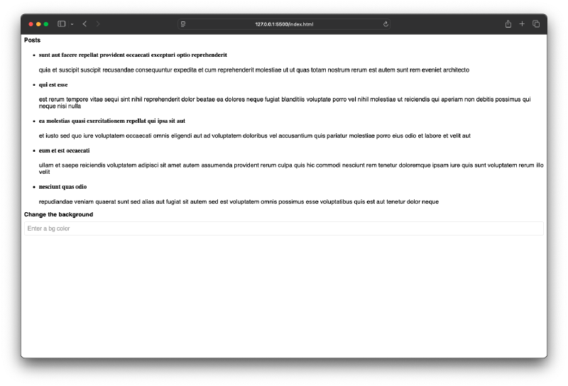
We have covered a lot of ground in this tutorial and previous ones as well. Before we wrap up this tutorial series, I want to quickly touch on the Alpine.js lifecycle hooks. Any Alpine.js component goes through a series of stages from the moment it is initialized to when it is destroyed. Alpine Component is a any HTML element that has an x-data directive on it. To demonstrate these things, I have created a new simple Alpine.js component instead of using our form component.
<body>

  <div x-data="demo">

    <!-- fetching data with init -->
     <div>
      <h3>Posts</h3>
      <ul>


      </ul>
     </div>

     <!-- $watch example -->
     <div>
      <h3>Change the background</h3>
      <input type="text" x-model="bg" placeholder="Enter a bg color"/>
     </div>

  </div>

</body>
And here is the corresponding JavaScript for this component:
document.addEventListener('alpine:init', () => {
  Alpine.data('demo', () => ({

    posts: [],

    bg: '',

  }));
});
init Hook #
The first lifecycle hook I want to show you is init. This hook runs as soon as the component is initialized. When the page loads in the browser, Alpine.js will initialize all components on the page. At this point that it automatically fires the init() function if it exists. Let’s add an init() function to our component:
init() {
      console.log('Component initialized');
},
If you open the browser console and reload the page, you should see the message “Component initialized” logged to the console. As an example we can use the init() function to fetch some data from an API when the component is initialized. Let’s fetch some posts from a public API and display them in the list.
init() {
      console.log('Component initialized');

      fetch('https://jsonplaceholder.typicode.com/posts?_limit=5')
        .then(response => response.json())
        .then(data => {
          this.posts = data;
        });
},
Now we need to loop through the posts array and display each post in the list. We can use the x-for directive for this:
<ul>
  <template x-for="post in posts" :key="post.id">
    <li>
      <h4 x-text="post.title"></h4>
      <p x-text="post.body"></p>
    </li>
  </template>
</ul>
Now when you reload the page, you should see a list of posts fetched from the API displayed on the page.
$watch #
The last thing I wanna talk about is how we can watch properties and react by firing a function whenever the property changes. This is done using the $watch method. In our example, we have a property called bg which is bound to an input field using x-model. We can watch this property and change the background color of the component whenever the value of bg changes.
this.$watch('bg', (newBg, oldBg) => {
      document.body.style.backgroundColor = newBg;
});
Now, whenever you type a color name or a hex code into the input field, the background color of the page will change accordingly.
And that’s it for this tutorial! But still there is so much more to learn about Alpine.js. If you want to dive deeper into Alpine.js, I recommend checking out the official documentation which has a lot of great information and examples.